Stumped on how to pick the perfect color scheme for your interior décor project? Tired of scrolling through Pinterest in search of inspiration? The classic 60-30-10 color rule might be the interior design trick you need to turn your space from blah to harmoniously delightful.
If you’ve never heard of the 60-30-10 rule or you’re looking for inspiration on the best practices for implementing the decorating rule, below you’ll find everything you need to know.
The 60-30-10 Color Rule in a Nutshell
First things first: What is the 60-30-10 color rule? Think of it as a flexible mathematical guideline designed to help you create a balanced, harmonious color palette for any space.
According to this classicinterior design trick, 60% of your space should feature one dominant shade. Around 30% goes to a complementary secondary hue. The remaining 10% is allocated to an accent shade that adds a splash to the color scheme.
The outcome using this formula is a space that feels and looks pulled together and cohesive—but not excessively color-coordinated. It creates equilibrium, rhythm, and unity.
How to Choose Your Colors

Ever looked at professionally-styled rooms in home décor publications and wondered how the designers pulled off such visual harmony? There’s a good chance the 60-30-10 color rule was in play.
Interior designers have used this timeless decorating rule to ensure perfect color scheming—and you, too, can tap into the proven formula. The concept is actually pretty simple once you grasp the underlying principles.
It all starts with picking the right colors – i.e., the end product is the sum of the ingredients or raw materials. Choose shades that blend and work together.
You can either go for a complete overhaul of your home’s color palette or build on the existing shades of your furniture. Whichever route you take, use the color wheel to pick the perfect color combination.
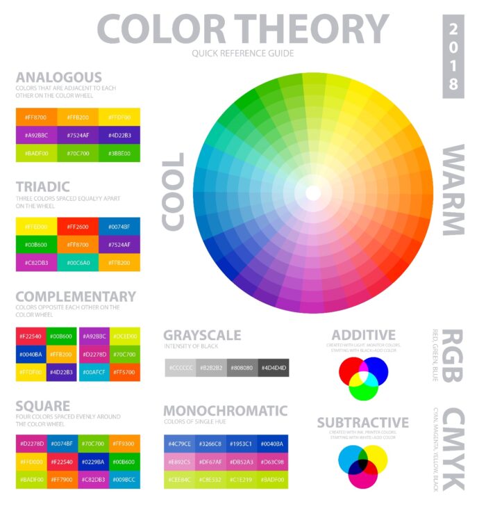
Here are color combinations that create a pleasing effect according to the color wheel and color theory:
- Complementary: Pick two colors on opposite sides of the color wheel. For example, if you’re going for a dominant purple hue, complement it with green. For the third color, consider a tone that is analogous to the secondary color (e.g., yellow).
- Analogous: This color scheme involves choosing 3 colors that are adjacent to each other on the color wheel. The middle hue is typically the dominant one.
- Monochromatic: For this look, simply pick one base color and add its darker and lighter variations to the color scheme. Consider using this approach with neutral palettes.
- Triadic: A triadic color scheme might be worth considering if you’re going for a bold and vibrant look. It involves finding 3 colors that are evenly spaced on the color wheel.
How Do You Use the 60-30-10 Color Rule in Your Home?
Got an idea of the colors to use? Great! The next step is applying them strategically to achieve the right balance.
This color rule is time-tested—proving to be an effective way to harmoniously add a splash of color to any room. But as with any interior design idea, the trick lies in implementation. Here’s how to use the 60-30-10 rule.
Dominant Color – 60%

The 60-30-10 color rule starts with applying the dominant color to 60% of the room. This will be the room’s overall color that will be immediately recognizable.
The general rule of thumb is to target the most visible parts of a room. Walk into the space you’re planning to revamp: What’s the first thing that grabs your attention color-wise?
Some primary objects that can act as the foundation of your color scheme include walls, area rugs, sofas, or large furniture pieces such as the bed.
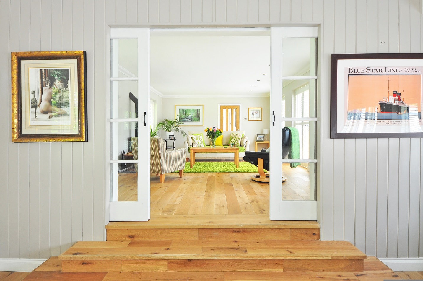
Taking the example of the above image, the dominant color is the shade of green used on the walls, area rugs, and accented on the throw pillows.
Secondary Color – 30%
Next up, you want to support the dominant hue while adding character to the space. It is important to be careful when picking the secondary color as it could make or break the overall aesthetic. The goal is to create a sense of cohesiveness.
Curtains, side chairs, smaller furniture pieces, rugs, cushion sets, kitchen countertops, bed linens, and accent walls are excellent choices to apply the 30% complementary shade.
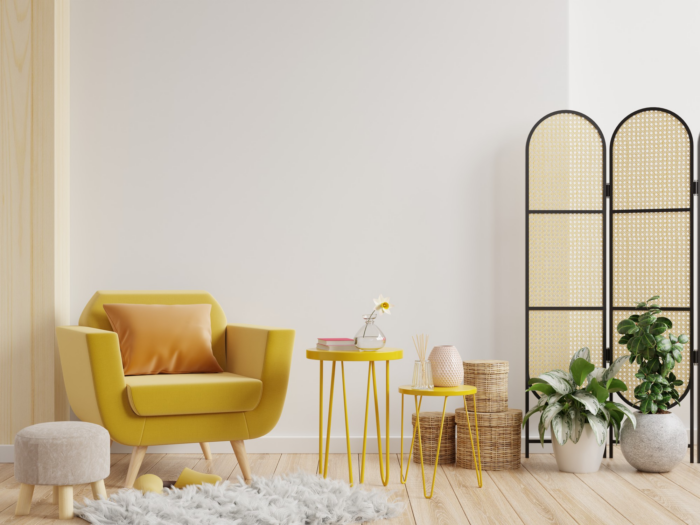
For example, yellow supports the dominant white hues in the image above.
Accent Color – 10%
Let your creativity shine when it comes to the 10% accent color. But within the boundaries and principlesof the color theory.The accent color is usually a hue that stands out for its boldness or subtlety. It gives the room some pizzazz while complementing the dominant and secondary colors.
Have fun by splashing your accent color on decorative accessories, artwork, throw pillows, or lamps.
Can You Break the 60-30-10 Color Rule?
The 60-30-10 is not set in stone. It’s more of a rough guideline than a precise mathematical formula. You mayfollow it to maintain the balance but don’t make a big fuss about the ratios.
Feel free to slightly tinker with the formula to meet your personal décor needs. For example, let’s say you need to add more than 3 colors. You can either give 110% and use two accent colors (i.e., 60-30-10-10) or break down the secondary color (i.e., 60-15-15-10). Just ensure the color scheme is balanced and not a messy hotchpotchof conflicting hues.
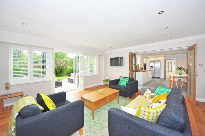
This space is a perfect example of breaking the 60-30-10 rule while maintain an element of harmony. White is the dominant color, brown complements it as the secondary color, and shades or grey and green accent the room.
Ready to Add Some Harmonious Color to Your Home?
The 60-30-10 color rule is a valuable guiding tool for any DIY or expert interior designer. It makes the process of choosing the perfect color scheme for your home a lot easier and the outcome a lot more pleasing.
But at the end of the day, follow your heart to achieve the perfect blend for YOU.